Abercrombie & Fitch
Fall 2015 to Summer 2019
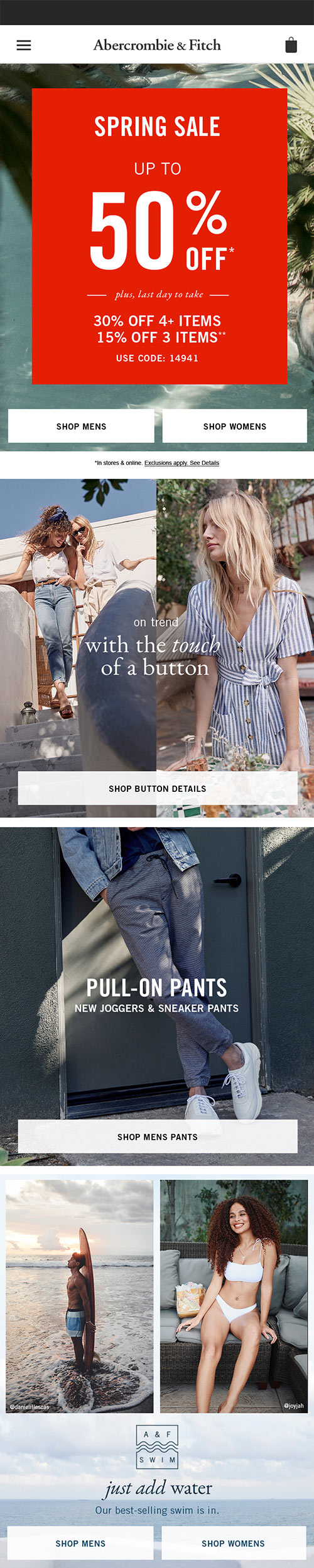
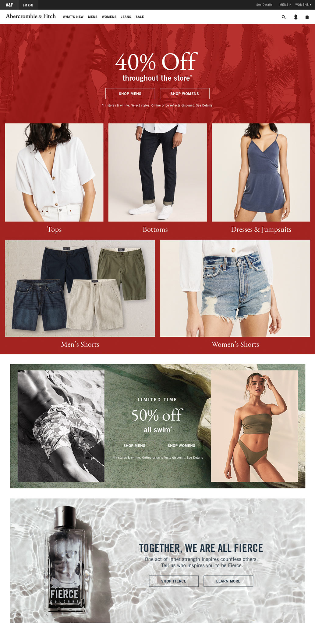
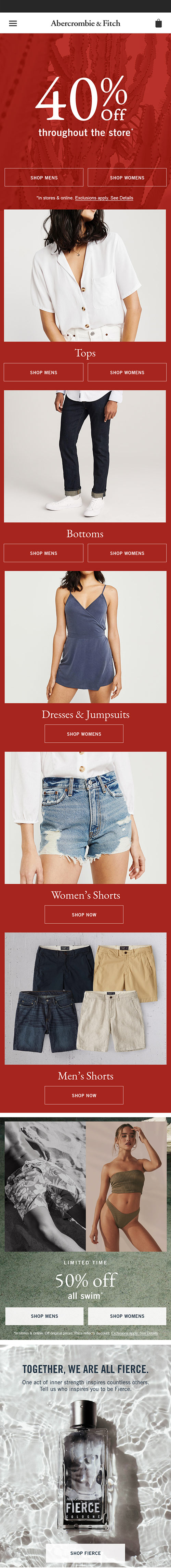
As a senior web designer I managed the e-commerce design through three brand redesigns and three holiday seasons at Abercrombie and Fitch, taking high level concepts and building a design system that was flexible enough for the creative director but structured enough for the development team to keep up with the website updates. My responsibilities included designing daily updates to the domestic and international e-commerce sites, presenting weekly to leadership, meticulously delivering high quality assets and spec sheets, and working closely with the web development team to create UI component systems. I also provided art direction for the marketing emails and social media.
E-commerce DesignDesign SystemsDevelopment DeliveriesMarketing Email DesignArt DirectionPhoto Direction
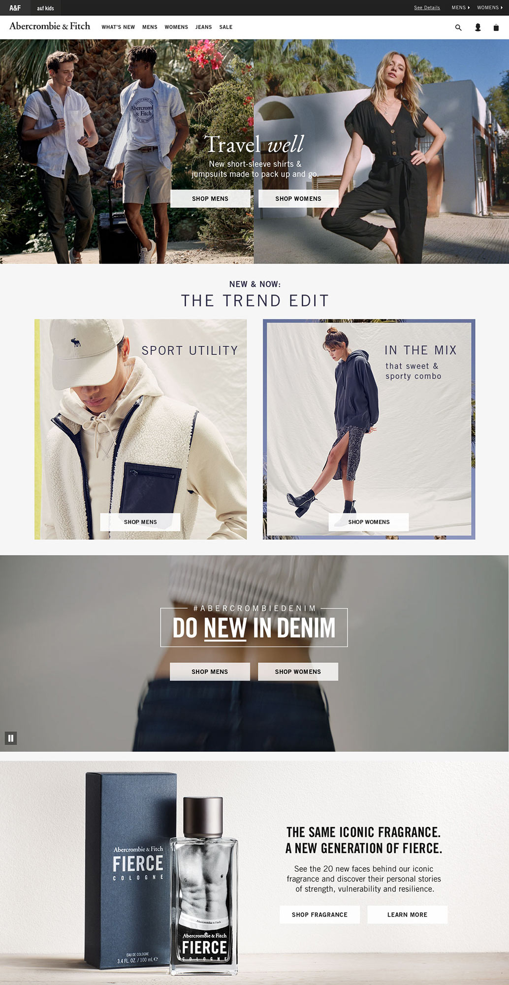
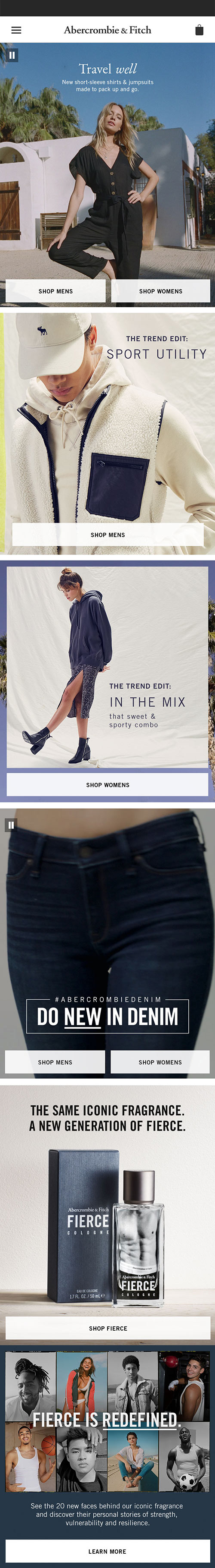
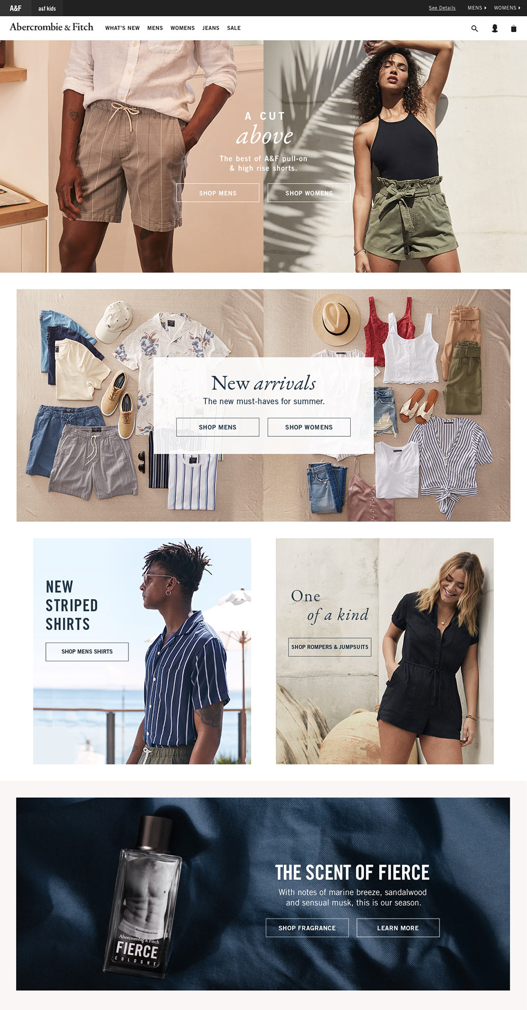
Homepage Design and Production
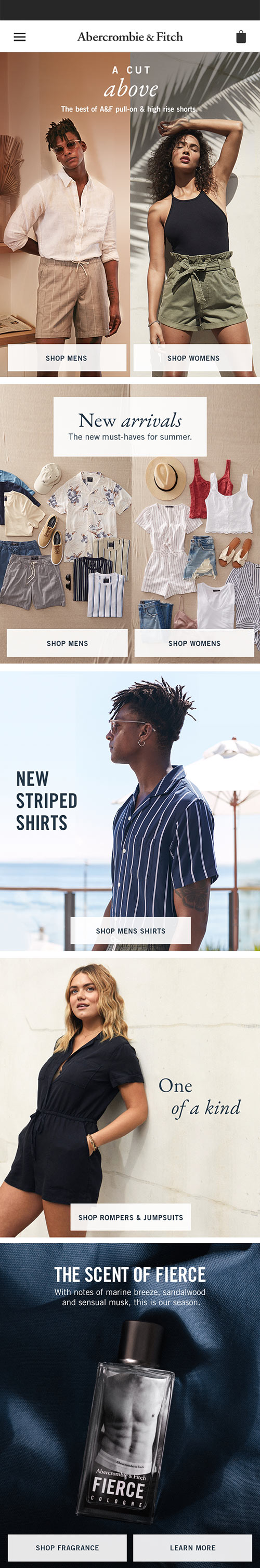
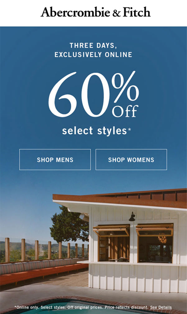
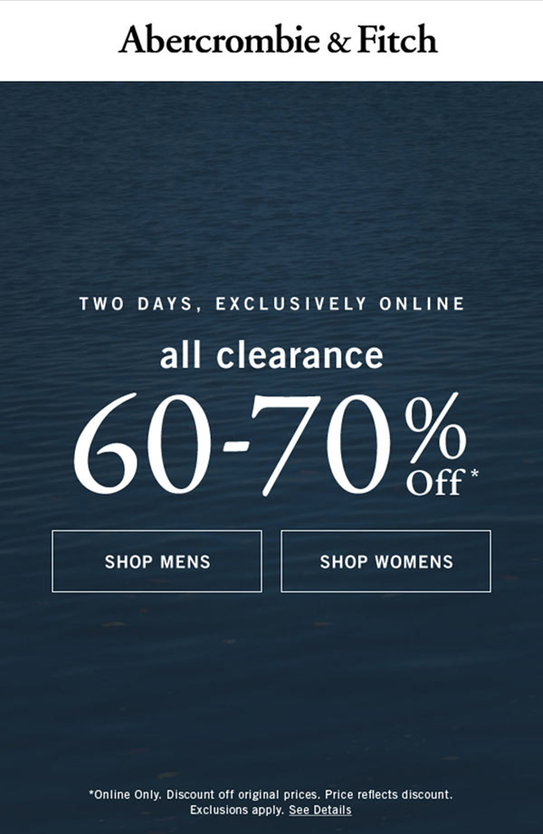
Offer Integration
Special Projects Email Design
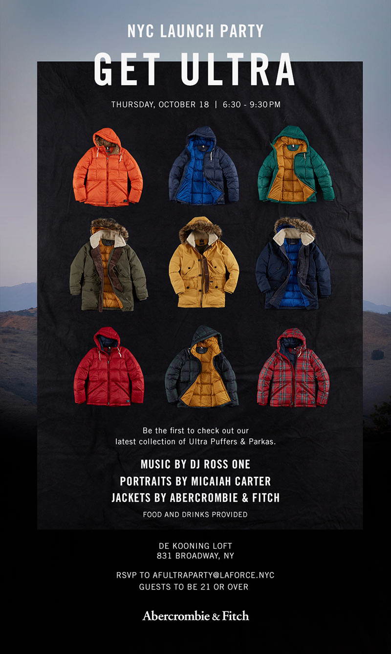
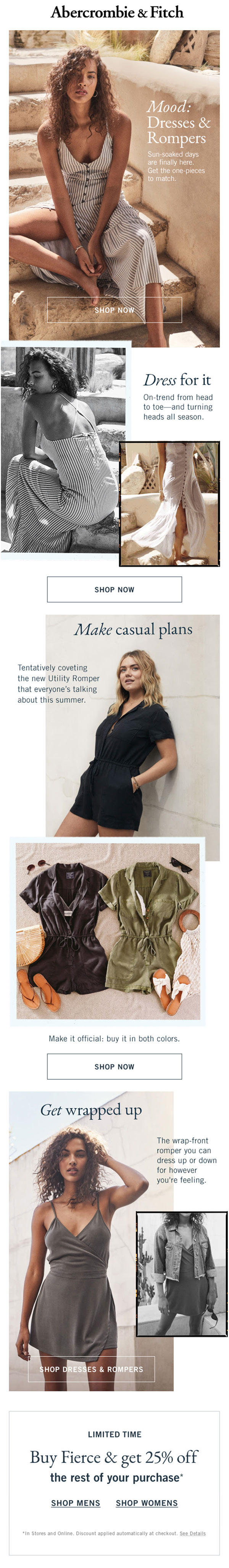
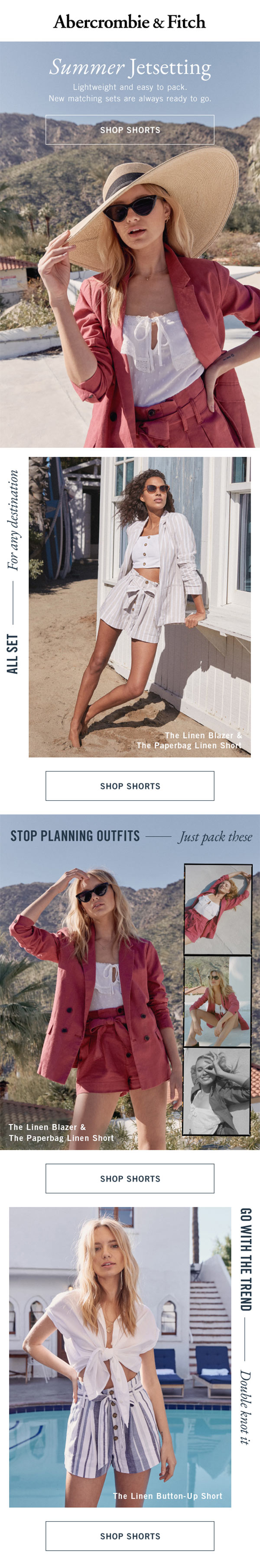
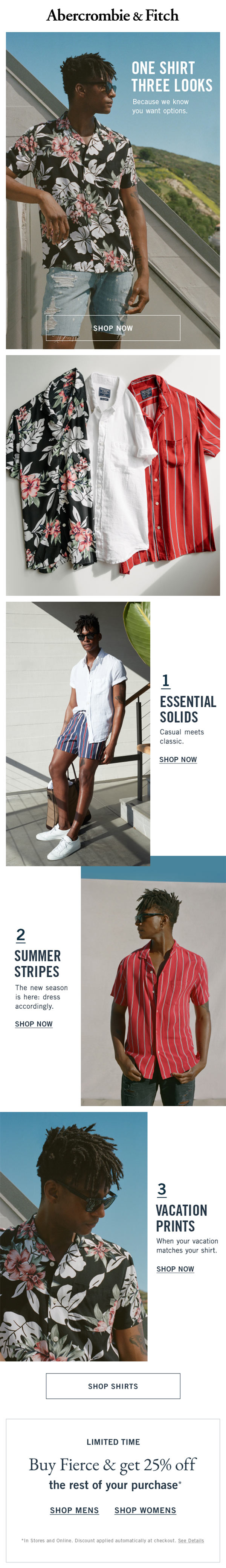
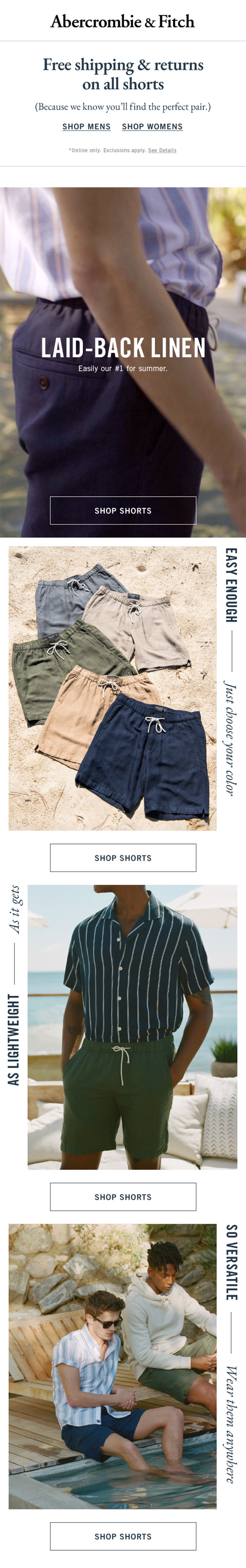
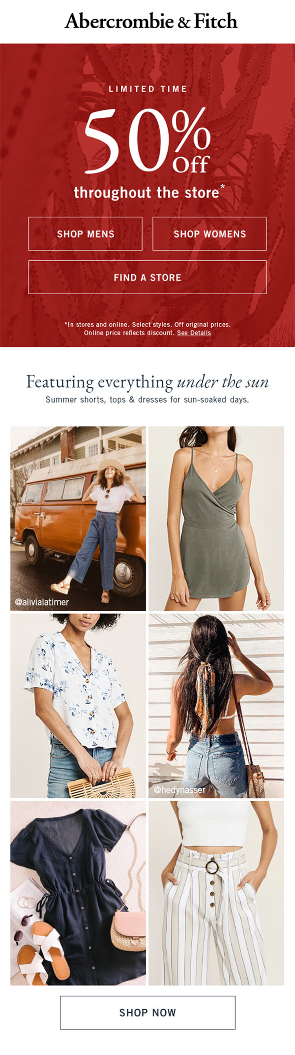
Marketing Email Design